


Work Details
The Brand Alchemist
A studio that had outgrown its own identity. We rebuilt it from positioning up — one mark, one palette, one set of rules the whole team can follow without asking a designer first.
- Client
- Alchemist Co.
- Industry
- Creative
- Services
- Brand Strategy
- Deliverables
- Identity Kit
- Tools
- Illustrator

An Identity Built To Survive Its Own Team
Alchemist Studio had grown from two founders to eighteen people, and three logo variants were in circulation — none of them vector. Every proposal looked like it came from a different company, so we started with the positioning work before drawing anything.
Positioning Work
Interviews with the team, their customers, and a look at every competitor worth watching.
Three Directions
Distinct routes presented side by side, so the choice is a decision rather than a reaction.
System Build
The chosen route becomes logo set, type scale, colour, imagery, and voice.
Handover
Every format cut from one master, plus a guide their printers and developers both use.

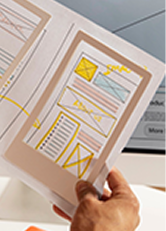


Nothing Was Written Down
Each new hire rebuilt the deck template from whatever file they were sent, so the brand drifted a little further with every pitch that went out.
There was no master artwork, no colour values anyone trusted, and no answer to the questions people kept asking in Slack.

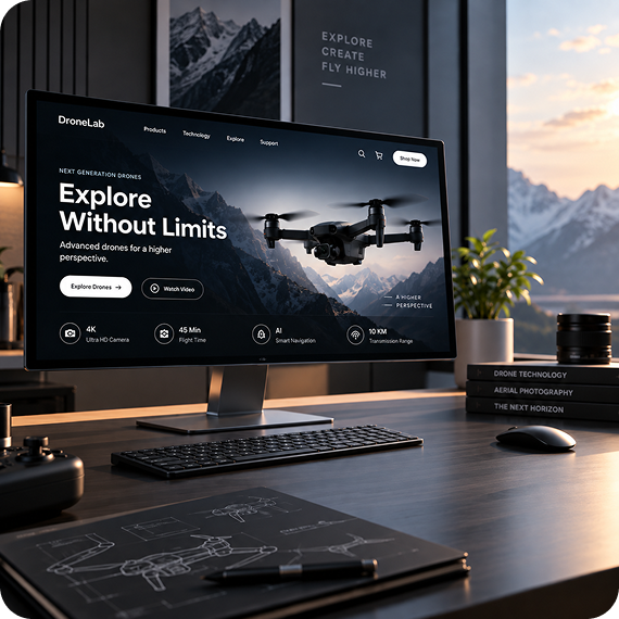
One Master, Every Format
A single source file cut into everything the team actually needs — vector for signage, optimised raster for the web, favicon and app icon sizes.
Alongside it, a short guidelines document that answers the recurring questions instead of restating design theory.