


Work Details
The Pixel Perfectionist
A dashboard that had grown to forty controls and needed a training call before anyone could use it. We rebuilt it around the three tasks people repeat every day.
- Client
- Perfect Pixel
- Industry
- B2B Software
- Services
- UI/UX Design
- Deliverables
- Design System
- Tools
- Figma, Maze

Density That Earns Its Place
We watched eleven sessions of real work and counted what people actually did. Three tasks made up most of the day, so the redesign puts those in view and moves everything else a single interaction away.
Session Research
Eleven recorded sessions of real work, turned into a ranked list of tasks.
Task Hierarchy
Primary work in view, secondary work one click deep, the rest in a menu.
Component Design
Tokens, components, and every state drawn once and reused everywhere.
Engineering Handoff
A system the developers consume directly rather than a set of static screens.

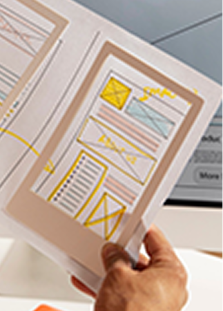


Everyone's Feature Was Essential
Each stakeholder defended a different control, and none of them had numbers to justify the space it occupied.
New customers needed a training call before they could finish a basic task, which slowed every rollout.

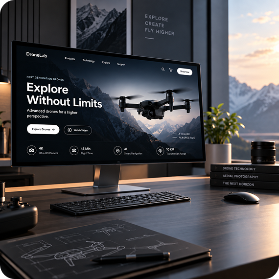
Evidence Instead Of Taste
Recorded sessions replaced opinion with counts, so cutting a control became a decision rather than an argument.
Time to first completed task fell from twelve minutes to under three, and onboarding calls became optional.